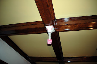
I can't stop thinking about the lights for the dining room but am still being patient. In the meantime, I have put together a fixture on Rejuvenation that I can live with. I have to have another go around with them to see if it works but it seems okay. I've gotten alot of great advice on this subject and it seems that I should hold out for smaller older fixtures that are less obtrusive. The alternative of living with the dark corners and buying beautiful Van Erps to lighten those small spaces up is probably out of the question also. I decided to consider the new fixture more seriously. In order to get an idea of how it would look in the room, I decided to do a mock up. It's not quite accurate but it does the trick. The neck is a little long and it is kinda crooked but it conveys the idea. Actually, I like the mock up so well, that I think I'll be making about a hundred of these for the ceiling for my next party.
I don't think it will look original to the home but that isn't too much of a concern. My big concern is to get light in the space, to have it look cool, and to compliment the rest of the room.
I am still concerned about how deep this canopy size is but I do like that it uses the same metal piece for the canopy that is used for the bottom finial on our main lighting fixture. I think it won't look bad at all with the other fixtures in the room. I also intend on using an old-looking exposed filament bulb so hopefully that will add to the interest of the fixture.
Then again, I still don't feel right about it all so for now, I will remain patient. Once I start painting the mural, the lack of light in the room will surely overcome me.


3 comments:
I think you want to get rid of the stem and the fancy scrollwork shade holder on that rejuvenation mockup. Do you not like the idea of having shades on the side fixtures (I might have missed part of the discussion) Since you have such an awesome, big central fixture, why not this for the side fixtures? http://www.rejuvenation.com/fixshowC897/templates/selection.phtml
Obviously with brass finish and a shade that complements the central chandelier. It has the same canopy and shade holder as the central light, no stem, and will be simple and complementary.
The Kellogg was my original choice but I really don't want a shade. I think anything would compete with the shades of the central fixture. Maybe a simple globe though. I am not sure. I love the idea of the old exposed bulbs though. There is a warmth and look to them that seems right. You are right on with the concern about the extension of the fixture. I am not concerned about the style though - it is the length that bothers me. I actually like the style and think that it compliments some of the transitional detailing in the house - our house is not Mission or Craftsman and, instead, has a lot of classical detailing like the compound trim, ionic capitals, lamb's tongue modling, etc. and the ecanthus foliage seems to be fine - if only it weren't so long and the kellogg canopy weren't so "deep".
If only they made a Kellogg fixture without a shade.
Post a Comment