We went "home" to Syracuse for the time between Christmas and New Years and visited with family. Typically, when I am home, I like to take at least one morning and drive around a bit and take in the great old buildings around town (and to see if any of them have been torn down since I was last there). My typical "tour" consists of buildings like this one, The White Memorial Building by J. L. Silsbee:

I never expect much in terms of new buildings and it usually isn’t long before I find a great old building that has been torn down and replaced with a parking lot or a butt-ugly development. It is rarely long before I am reminded why I left this place.
The city’s largest development, that has been in the works for several years now, is a mega mall that will pretty much swallow up the city in suburban Disneyesque schlock. There is a huge model of the schlock at the garishly re-decorated Carousel Mall. When Carousel was built, I often referred to it as the scary mall: it is a terrible piece of hulking, bland architecture awkwardly placed at the edge of Onondaga Lake near the mouth of the old barge canal.
 The "additions" to Carousel don't seem to be much better. They continue their awkward relationship to the surrounding area with oddly-scaled "traditional-looking" protuberances. The funnier part of this development is that it intends on being the "greenest building" in the US. I don't think they just mean the color either. Now that is funny. Covering a waterfront area with enclosed mall and a sea of parking as a monument to consumerism in lieu of a traditional neighborhood development and urban parkland sounds SOOO green to me.
 Anyway, I haven’t been home for a sustained period in over a year so I was shocked when, in my drive around town, I came across not one but several nice buildings. Actually, given the degree of difficulty that seems to exist to getting something nice built in Central New York, I am inclined to say these are great buildings.
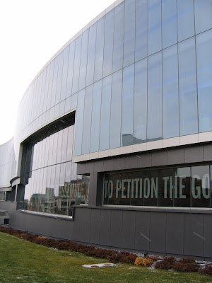
The first of these has gotten much press internationally: the latest addition to the Newhouse School. It is an absolute gem designed by Polshek Partnership. It is in a prominent spot overlooking the city and seems fitting as school's alums are a list of who's who in news and sports broadcast personalities.


The next beauty is just over a block away and is the home of the new Children's Hospital. This building shouts for attention with a remarkable array of windows, materials, and huge "tree house" cantilever. It has a commanding presence alongside the majestic Crouse Irving Memorial Hospital but they seem to make a nice pair. I believe that the design is from Karlsberger, a firm that specializes in hospital design.


The third building I noticed on the hill is a building called "Link 2" and was designed by Toshiko Mori. I don't know much about it except that it is way cool looking and seems to settle nicely in the field of historic structures adjacent to the quad.
 The final building I checked out is yet another Toshiko Mori design for the Center for Excellence. It is in the middle of construction but you can already tell it is going to be an awesome addition to the city. It is unfortunate that they couldn't salvage the old Smith Typewriter factory that used to be on the site and re-use that for something. I always think that if you need to tear something down, you better put something great in its place. In this instance, they did just that.

 I am not quite sure what inspired Syracusans to begin building such nice buildings. My guess is that they nothing did and that these structures are not "home-grown". None of these seem to be designed by local architects and given their relation to the University, I highly doubt a local person was involved in shaping the architecture. Maybe, hopefully, I am wrong in this assumption and that someone in this town is starting to wake up.
As I said, all of the new buildings are in one way or another connected to the University so my hope that this same kind of inspiration might soon be shared with the residential and public developments as well is pretty low. Plenty of evidence seems to support my concerns. There is a not so great building going up in Armory Square, adding to the mediocre array of new developments in this area of otherwise awesome turn of the century warehouse and wholesale structures. Also, plenty of incredible structures stand vacant in the downtown area, desperately in need of attention. Sadly, I don't see Mayor Driscoll or Bob Congel spearheading great developments in downtown that mirror the ones mentioned above anytime soon. Either way, it is nice to see that some things are changing for the better in CNY. Hopefully it will start to become contagious.
 I never expect much in terms of new buildings and it usually isn’t long before I find a great old building that has been torn down and replaced with a parking lot or a butt-ugly development. It is rarely long before I am reminded why I left this place.


 The next beauty is just over a block away and is the home of the new Children's Hospital. This building shouts for attention with a remarkable array of windows, materials, and huge "tree house" cantilever. It has a commanding presence alongside the majestic Crouse Irving Memorial Hospital but they seem to make a nice pair. I believe that the design is from Karlsberger, a firm that specializes in hospital design.
 The third building I noticed on the hill is a building called "Link 2" and was designed by Toshiko Mori. I don't know much about it except that it is way cool looking and seems to settle nicely in the field of historic structures adjacent to the quad.


3 comments:
I so agree with you statement
If you tear something down replacing it with something great. There are so many poorly designed buildings out there replacing great well built historic architecture.
Nice buildings. I like the hospital. Like a cubist's painting, only in 3d.
I love the hospital! Glad to see some nice recent architecture. All we get around here is half baked "historic" missmashes thrown together with shoddy and inappropriate and cheap materials@!
Very interesting architecture! I've never been to syracuse, but will likely drive through on my way to NYC next week (from Buffalo). I'll have to make sure to keep my eyes open for the great architecture! Nice post.
Post a Comment